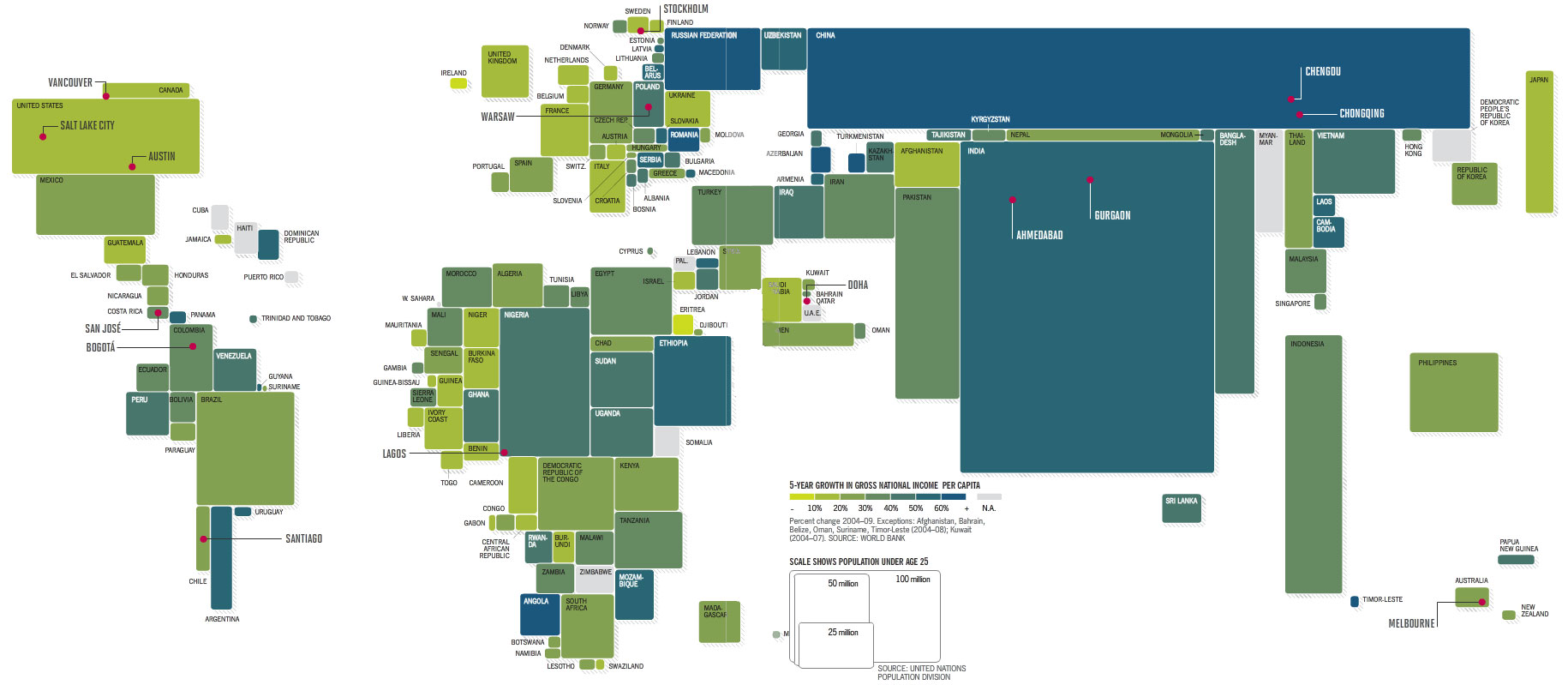
As part of their "global 500" report Fortune magazine published this excellent map of the world, with the size of each country proportional to its population:

world by population (click to enbiggen)
I love this map; it shows just how small the U.S. is compared to the world (that's us in green rectangle at the upper left), and the comparatively huge populations of China and India, and the basically equal sizes of Brazil, Nigeria, Ethiopia, Pakistan, Indonesia. You read these numbers but nothing like a diagram to bring them home. I will refer to this often.
|