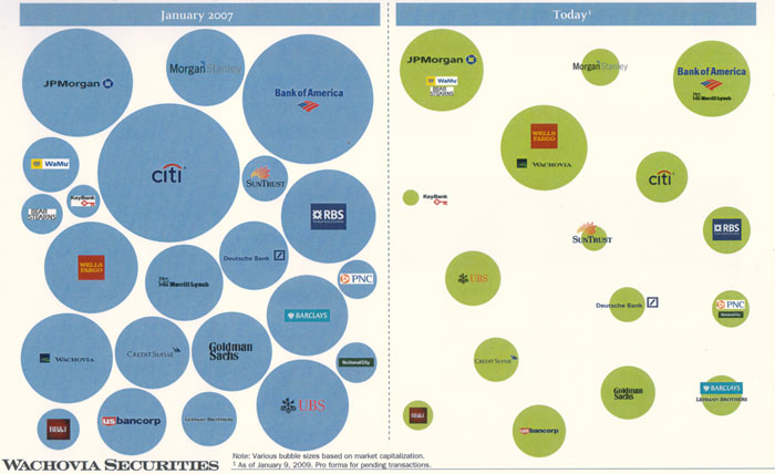
Want to see something pretty incredible? Check out this infographic from Wachovia Securities, comparing the banking industry in January 2007 to January 2009. The size of each bubble is proportional to the market cap of each bank.

I wonder how much of the difference is due to decreases in the value of their lending portfolios, particularly mortgages, versus a decrease in consumer confidence and market values in general?
| 


